Delta Airlines Decision Support Tools Brief
There was an initiative at Delta airlines to modernize the information that the dispatchers had in the control tower. The dispatcher is the person at the airline that remains in contact with the pilot of the plane until it lands at its destination. The dispatcher is an employee of the airline (as opposed to the airport, like air traffic controllers), and is responsible for many duties for each flight such as coordinating crews, monitoring weight and distribution, making sure that the catering gets there on time, makes the calls on cancellations, manages arrival and departure delays, manages de-icing stops, and more.
In this case, several such tools needed revamping. For a dispatcher, seconds can count, especially when managing multiple planes at the same time. All of this data previously was displayed on the screen in basic tables. Delay times had some visualizations, but at times they only seemed to complicate things. The idea here was to take the data from the tables and display them in such as way that the dispatchers could understand everything with just a quick glance, and make both faster and better decisions.
If you think in terms of the OODA loop (Observe, Orient, Decide, Act), they had all the data (Orient), but were being asked to make decisions without having a big picture of the Orient step of the loop shown to them. They had to build the picture in their head, or simply use the tables over and over until they got more intuitive with them so that they could do all of the orienting themselves. It’s not easy, and they shouldn’t have to where there are tools to make the decisions for them.
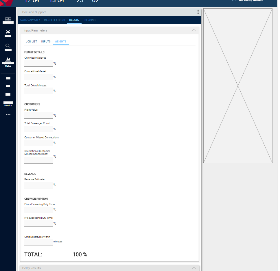
Another part of the brief was that for certain tools, the dispatchers needed to be able to adjust certain variables and see their impact. Following are some examples of the UI screens designed for them after a number of interview and contextual analysis done with the dispatchers and the UX team.

Gate capacity is when an airline has to manage how many gates that they have in use at an airport vs the number of planes that are arriving and departing. If an airline has 100 gates open, most of the time that is plenty, but if during peak times they have more than 100 planes o the ground either waiting to taxi up to the gate, waiting to be cleaned, or waiting to depart, there is a problem. In this case, the flights must be managed by pushing planes in or out early or late, in an effort to get the planes to the gates as quickly and efficiently as possible, with less than a 5 minute wait for any plane on the tarmac. This could mean that if a plane is to arrive at gate 21, but the departing plane is still there because it got delayed, the station manager and dispatcher may have to route it to gate 17 at the very last minute because that plane is about to leave.
The original screens that the Station Managers had for gate capacity resembled the middle section of this page. Look at the section with the column row headers “Carrier,” “Flight Number,” “Origination Station,” etc. Now imagine that table, with a number of extra columns, and 100 lines long in some cases. Imagine that the columns were not grouped together by function, but rather placed on the screen alphabetically. THAT was what the Station Managers and dispatchers had to go on in order to make certain decisions.
My approach here was 4-fold:
Get rid of the columns that don’t really matter to reduce the noise
Organize the columns by function
Show the gate utilization vs capacity at all times so that at any one time a Station Manager or dispatcher knows if things are tight or not, or will be soon.
See the computer’s predictions for the future, and read in the computers recommendations for gate switching and delays in order to maintain efficient gate utilization.
In the above example, the screen is divided into 2 sections:
The “Holdouts and Delay Recommendations” section
The “Gate Capacity” section
Let’s start with the Gate Capacity section. The blue vertical line represents NOW. Everything to the left is what has happened, and everything to the right represents what is predicted to happen. As you can see, at about 1700 hours, there will be more planes on the ground (170) than there are open gates (160). This means that planes will be waiting around, and this could be a problem. The graph, unlike a table, shows this information instantly, and it shows exactly HOW bad it will get. The Station Managers and Dispatchers can also see that they have about 4 hours to make adjustments to avoid the situation.
The first part has 2 sections.
The 1st section only contains 3 rows of data. These are the only rows that the dispatcher really needs to have a good situational awareness. The columns are time columns, by the hour. The table’s middle row shows the expected Holdouts, or planes that could be waiting on the tarmac. The table can actually scroll right or left for up to 12 hours in the past and 24 hours in the future. Anything above 4 is bad, and will be highlighted in red as you see in 3 of the columns, where we have 5, 8, and 8 holdouts, respectively. When the user clicks on the column where we have holdouts, those holdouts are shown in the table underneath, the 2nd section.
The 2nd section is the raw table, with the unnecessary columns removed, but JUST for the holdouts in the table above. There is no need for endless rows of data for planes that are not holdouts. We don’t care about those. We only care about the holdouts.
You can see with this screen, we give the station managers and dispatchers exactly what they need, and ONLY what they need in order to assess the situation: will there be holdouts? Who are they? when will they become holdouts? How much time do I have, and how can I manipulate arrivals and delays accordingly to minimize them? If it’s not a Holdout, we don’t see them in the raw data table.
In the screenshots below, you can see how adjusting input parameters, and giving each one it’s own weight, allowed dispatchers and station managers to recalculate delays in order to minimize them and holdouts.


De-icing was another issue that needed attention:

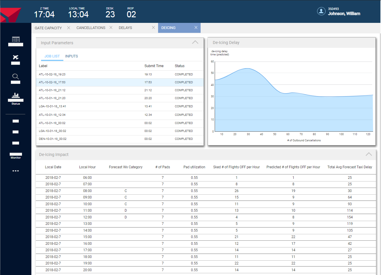

Here you can see how simply by adjusting the inputs, and running those calculations, the dispatcher can immediately see the affect on de-icing delays vs cancellations. For example in one of them we can see the following:
At the current rate (0 cancellations), the result will be a ~45 minute de-icing delay for all planes that must be accounted for elsewhere.
If we cancel 20 flights, we can bring the de-icing delays down to about 25 minutes.
Cancelling more than 20 flights will not gain us any decrease in de-icing delays
This information can all be gleaned at an instant. No scanning through tables, no making calculations in your head, or anything. Simple, and instantaneous.
The last example here is Tankering, or fueling. For this example, you can click here to see a PDF of the basic brief that I gave the project leader and stakeholders after I had conducted my dispatcher interviews during discovery (please excuse the typos in the document). The screens in the brief were a low-fidelity first iteration pass. The important part was to show that my solution would be able to meet all of the dispatchers needs and sensitive points. Prior to this project, they dispatchers made use of multiple tools and had to make the connections between what one tool showed and what another did in their heads. The final product was much nicer looking (this was really medium-fidelity) and included an on-screen widget that could be torn out of the browser window so that the dispatchers could always see when there was going to be a fueling issue with any flights at any time.