
Attack path analysis
Security software tends to be highly specialized: A vulnerability scanner shows the vulnerabilities for each individual resource, a network scanner shows network-based vulnerabilities, and Identity and Access Management security tools show misconfigured and over-privileged accounts, and so on. Everything is siloed. Attempting to manage security in this manner, without the context of the interconnectedness, leaves security admins with blind spots.
We needed a way to break through the silos and show how resources are interconnected across all of these security domains, and present all that complex data in a very easy to understand way, allowing users the ability to:
See their resources and cloud the way that hackers to
Examine their cloud resources with full context
Eliminate security blind spots
Give them the ability to better prioritize fixes - no one wants to spend weeks fixing security issues for resources that have little business value while inadvertently leaving "crown jewel" resources exposed, waiting in an endless queue to be fixed.
I worked with customers and our developers and Product Management to come up with a visual language and workflow to expose these interconnections, and allow users to think more like hackers, while uncovering hidden interconnections and exposing security blind spots and prioritizing security remediations.
The biggest problem with network defense is that defenders think in lists. Attackers think in graphs.“ - Jon Lambert
The possibilities were endless. Or at least, potentially difficult to manage.
Through initial hypothesis, user interviews, and competitive and industry analysis, I discovered that organizations struggled with uncovering “invisible” attacks like lateral movement, had great difficulty in managing multiple security layers and determining fix priorities across all of their cloud resources, and a lack of visibility into threats in the right context.
(some early prototypes created during the initial ideation phase)


As organizations could have potentially millions of resources to manage, we quickly realized that the solution had to be comprehensive, and yet able to slice and dice and divvy up resources in such a way that the customers could easily manage things at scale. This is no easy task! We had to figure out a way to show them what was priority, and eliminate the noise that plagued our competition and left users with mountains of resources to fix with no real context-based prioritization.
Not biting off more than we could chew, and eliminating noise
We had explored multi-path options, groupings, and other visual representations, but decided that for version 1 those might be biting off more than we could chew. Initially, we decided to show single paths at a time. It’s better to get that, and all of its interactions, correct before we include multiple paths and more.
First, we limited the resource types on the target resource. A “target” resource of a NIC (Network Interface Card) doesn’t really make sense. Users don't need to see attack paths for such things. This was accomplished by the developers on the back-end.
Next, we had to figure out a way to distinguish "Business Critical" or "Crown Jewel" resources from lesser priority resources. Because something like this impacts the entire product, and not just this feature, a team was created to tackle this problem. We had enough data to both figure these things out automatically for the users, as well as allow user to tag items with the appropriate flags. These would feed into an algorithm developed by that team to determine priority taking many things into account, not just attack paths.
Once we had these resources narrowed down and the potential noise filtered out, our algorithms traced the paths, and my visualization mapped out that data to a simple interactive graph.
But that wasn't enough.
We also had an entire workflow to figure out and manage as well.

We have to provide evidence within the UI that this is a legitimate path. We have to show how that node could be compromised along this path, and how it could compromise the next resource link in the chain that ends with business crown jewel resources and data.
That context is data that we had available, and had already stored during the initial path mapping on the back end. We just had to figure out an initial way to display this.
After much debate taking into account the many project parameters - such as our time frame to deliver, that this is v1, the exponential increase in size if certain parameters were to be included, etc.), and trying to make sure that the security evidence was displayed simply, yet comprehensively - and discussing ideas with users throughout the entire process, we settled on a locked card paradigm for v1.
A simple example of the locked card paradigm on the left. The card, which displays security information, is scroll-locked to the node above it.
The solutions. For now.
The visualization itself:
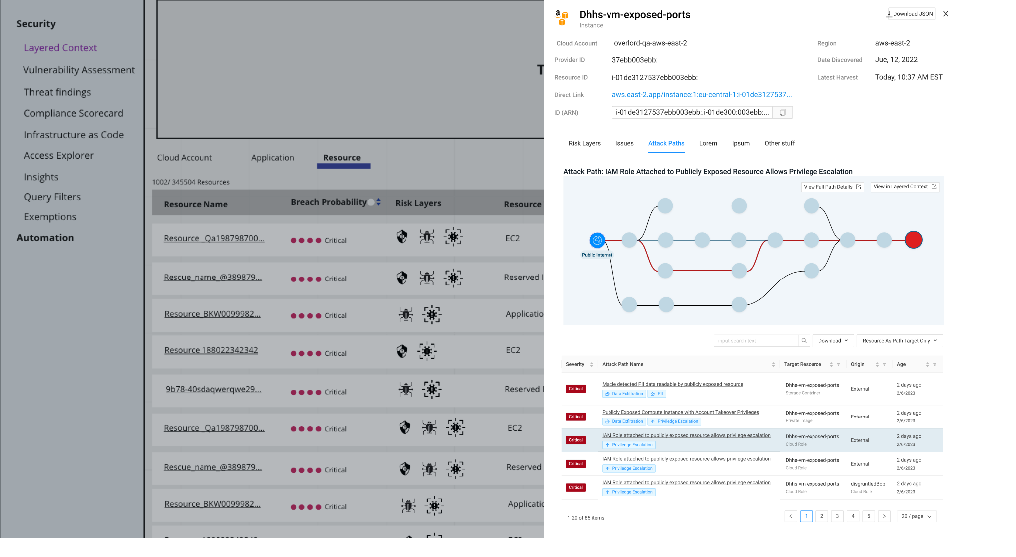
The Attack Path would be displayed, and under each node in the path would be a card locked to that node (for when the graph might require side-scrolling). The card would contain all of the evidence that we used to determine why THIS node was on THIS path. THis would include vulnerability information, information on misconfigurations, privileges, and more.
Users can now see the full path, and all the factors that will allow an attacker to penetrate deeply into the users’ networks, gain a large foothold, and ultimately compromise a critical target.
(medium-fidelity mockup of the single path attack path analysis visualization)

The workflow:
After discussions with user on how they might use a feature such as this, and how it would fit into their daily tasks, we decided that we didn't want to force users into a single navigation paradigm. This could take users away from their natural workflow and be disruptive. We wanted the users to be able to see resource-related attack paths as they went about their daily tasks. We also wanted to have a single "home page" for these as well: A place for users to go and be able to answer the question "What attack paths to critical resources do exist in my environment?"

The Workflow
After discussions with users on how they might use this feature, and how it would fit into their daily tasks, we decided that we didn't want to force users into a single navigation paradigm. This could take users away from their natural workflow and be disruptive. We wanted the users to be able to see resource-related attack paths as they went about their daily tasks.
We also wanted to have a single "home page" for these as well:
We built a "home page" where attacks paths and visualizations would live, as a queryable, and filterable list of paths, and we integrated the attack path feature into areas normally outside of this feature, permeating it into the product as a whole so that users could access attack paths directly within the context of their daily security activities. This would be a place for users to go and be able to answer the question "What attack paths to critical resources do exist in my environment?"
For example, on the Layered Context screen (a different, but related feature) and in the resource inventory screen, information about attack paths is readily available as a condensed visualization from which users can navigate to the full visualizations with a single click.
The Path Forward
Many of the things that we wanted to accomplish for this feature were simply not doable in a single quarter. We knew that going in. So we staged the feature across multiple quarters. While v1 was being released, and indeed when it was still being developed, we were already had at work working on version 2 and multi-path visualizations. The back-end needed taming as we needed to determine which resources to use for source and target nodes. Which would just be noise, and which were actually pertinent? I started working on prototypes for multi-path visualizations (no more cards!) and a new security side panel. Examples of some hi-fidelity mockups can be seen here:


Lessons learned:
There were a myriad of different ways to look at this visualization feature, and there would be even more when we got into multi-path diagrams.
The card paradigm won't work for multipath - we had to come up with something else. The answer was a security specific side panel that appeared once you clicked on a node that displayed everything you needed to know about a particular resource within the context of security. While this was technically slated for v2, we designed it during the initial phases for v1.
Once we include multi-path, we were going to include internal resources as starting paths. This increased the amount of path possibilities AND the overall complexity of the feature by an order of magnitude. It became absolutely crucial that we limit the graphs in the v2 of this such that we aren't just showing EVERYTHING, and only showing the users what they actually needed. Noise elimination would make or break the feature as it expanded.
I realized early on when I designed the initial "home page" for attack paths in the system that it would have to be fundamentally rethought for multi-path, and the paradigm used wouldn't work in that new context. so we knew going into v1 that there would be a re-design for v2.
We needed to figure out a way to better integrate with other product feature areas such as Layered Context.
We spent so much time focusing on the visualizations, product integrations, and making them as intuitive and comprehensive as possible, that we didn't focus enough on the END of the user workflows: Vulnerability and misconfiguration remediation. Our users needed easy and fast automated fixes (where possible), and in as few clicks as possible, as well as more ticket system integrations. That was going to be a priority in version 2.